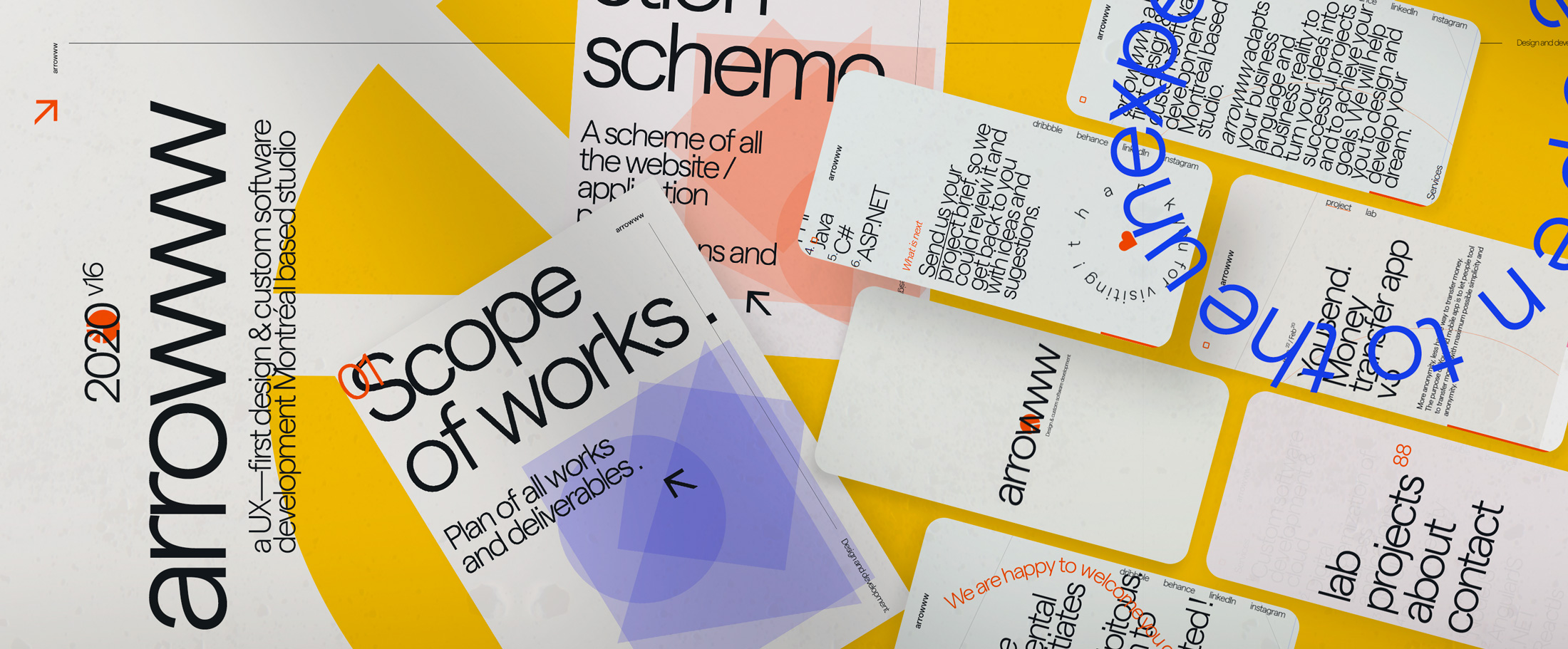
The impetus of all my personal works is a desire to create beautiful things, something that follows developed rules, creates an impression of harmony, something that has it's own personal language and individuality.
As always, I have made many tests. A few complete versions of identity and website designs were created, before I felt that I am ready. Version 15, which was not finalized, was also developed, but did not make it to production.
The Lab of this project will demonstrate the path I went through, before I have found the communication language, which Arrowww version 16 will be using; and I was satisfied with it.
In advance I would like to thank you for your time and hope you will find my work interesting.
Brand identity
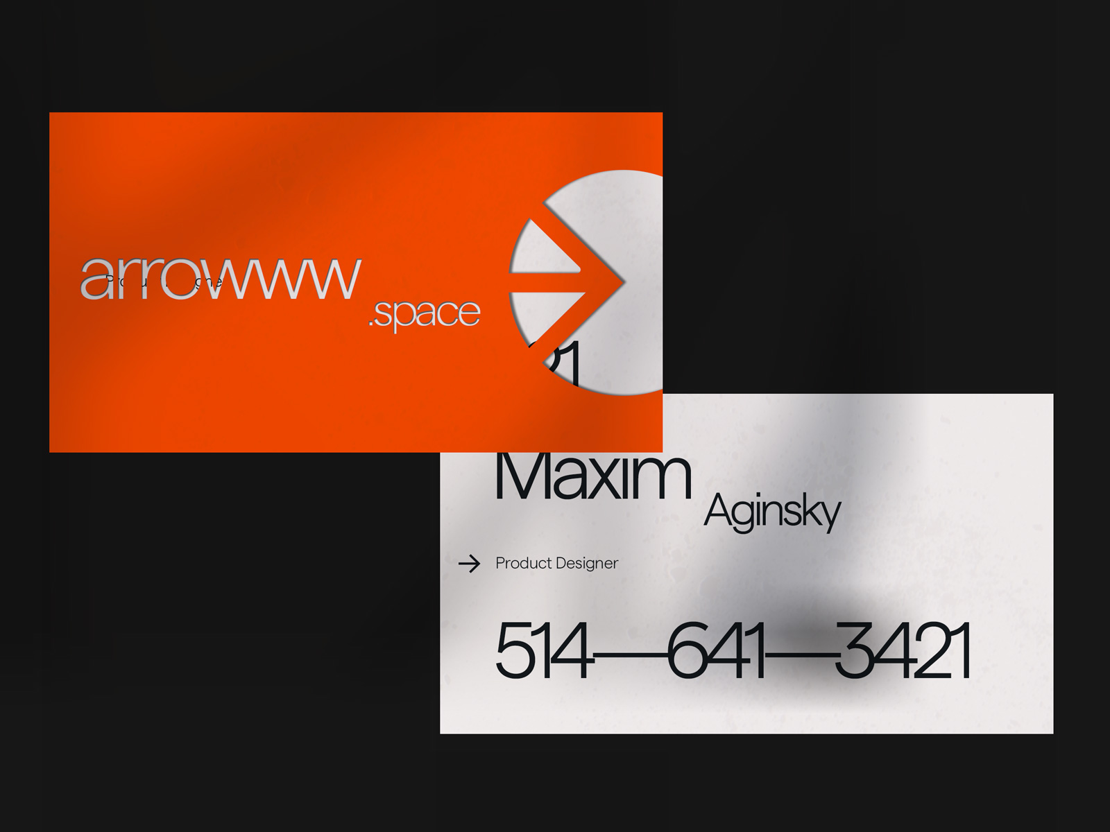
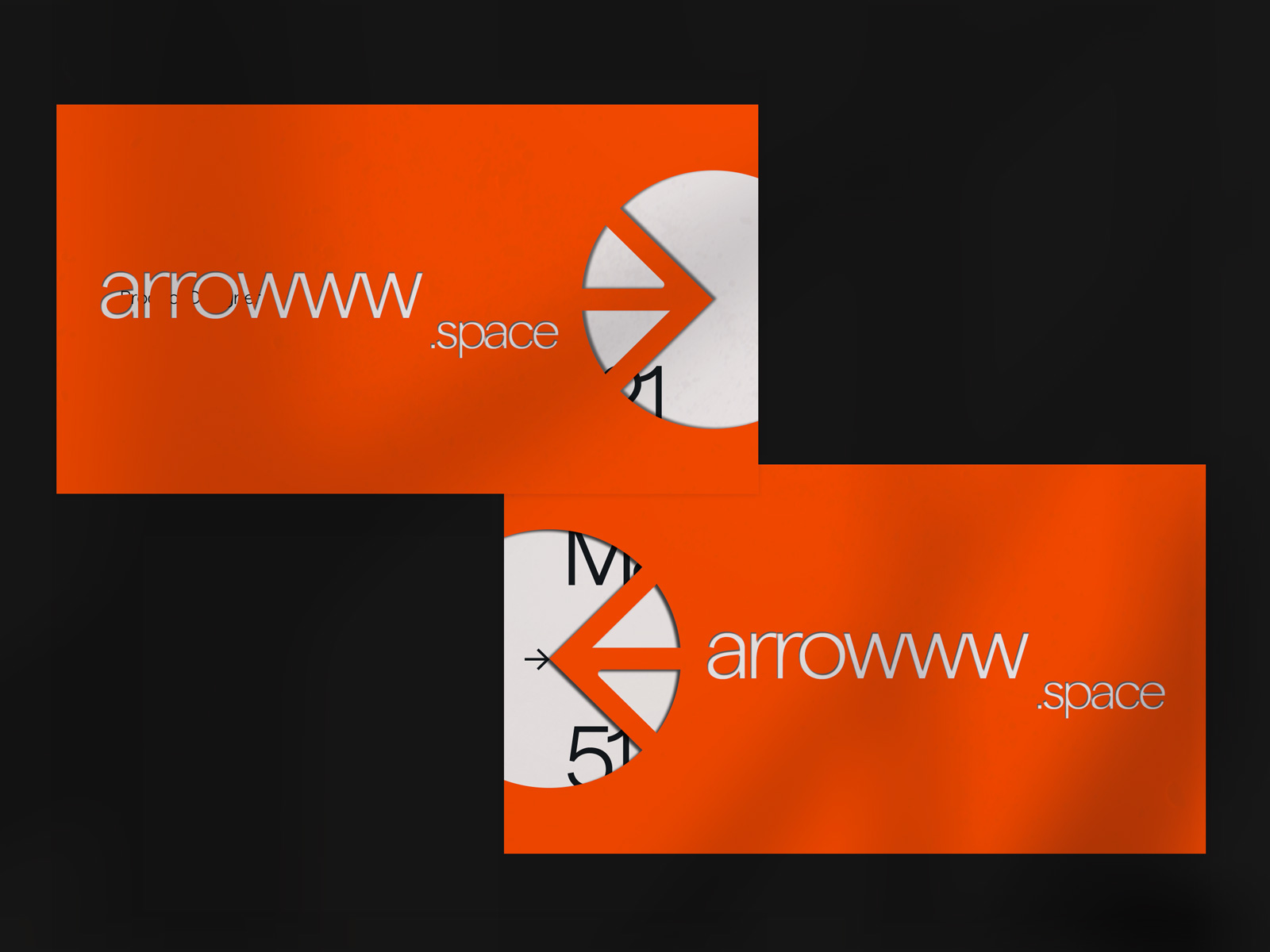
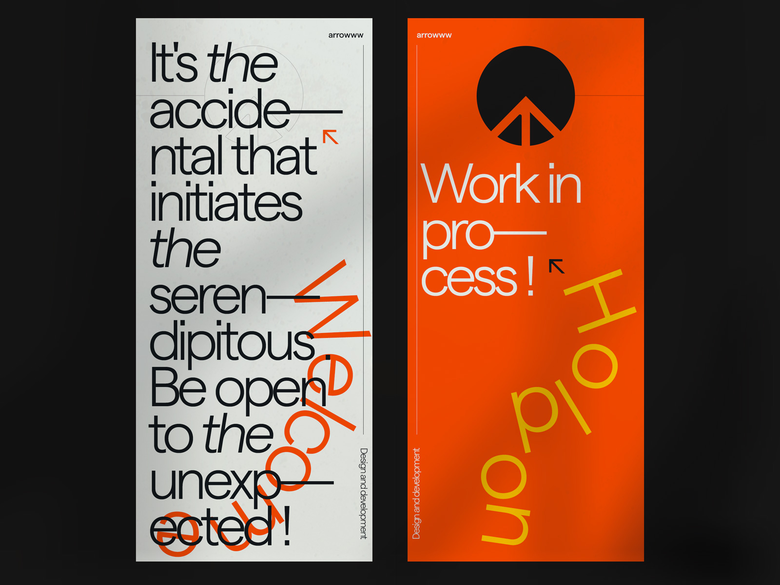
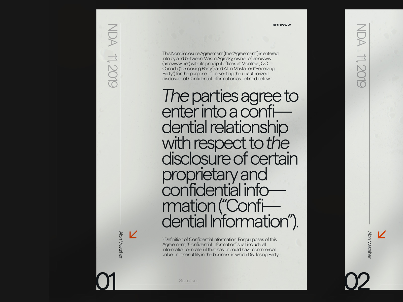
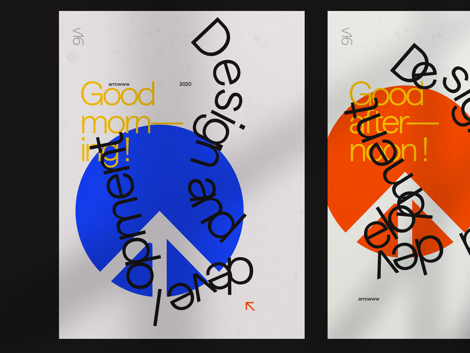
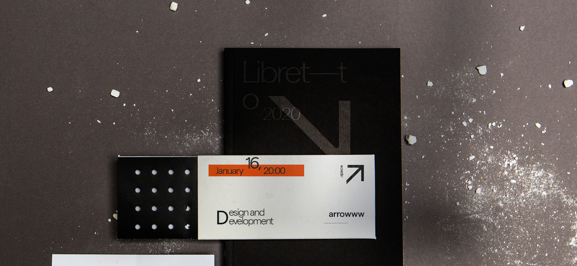
The working process on the materials related to this section (business card, posters, door hanger flyer, NDA, price list, contract and resume), have been helping me to understand the overall mood and rules this work will follow. The website design was created only after I have completed the identity stage and entirely followed the established principles.
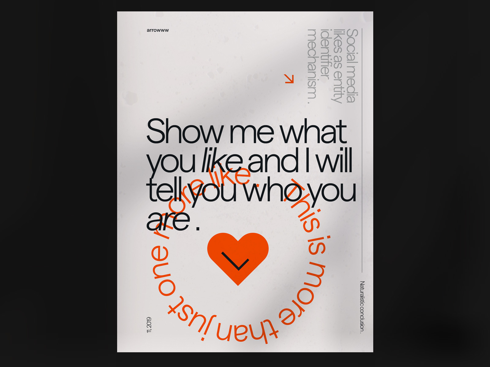
What you like is who you are. A naturalistic conclusion
Social media likes as entity identifier mechanism (based on the social media likes, we can understand the person's identity).
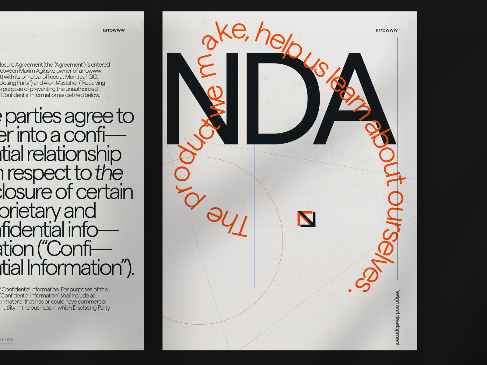
NDA
The product we make, helps us learn about ourselves.
Price list
Each type of documents are organized by folders.
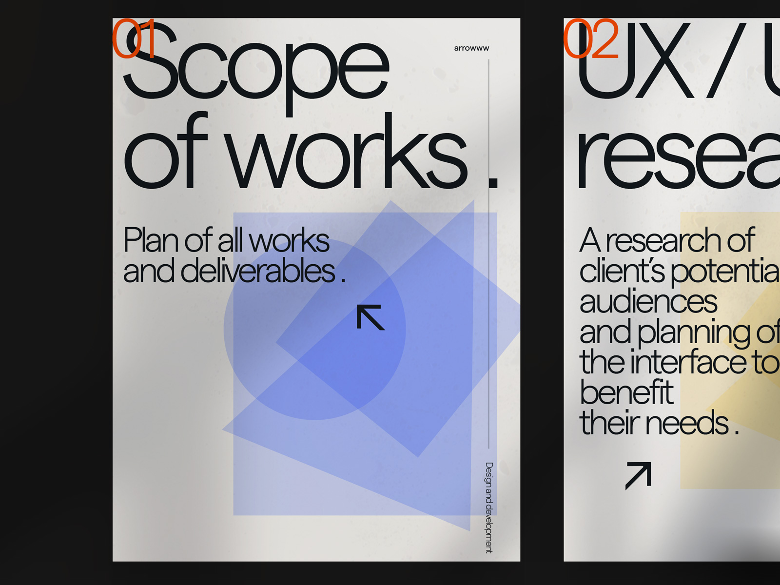
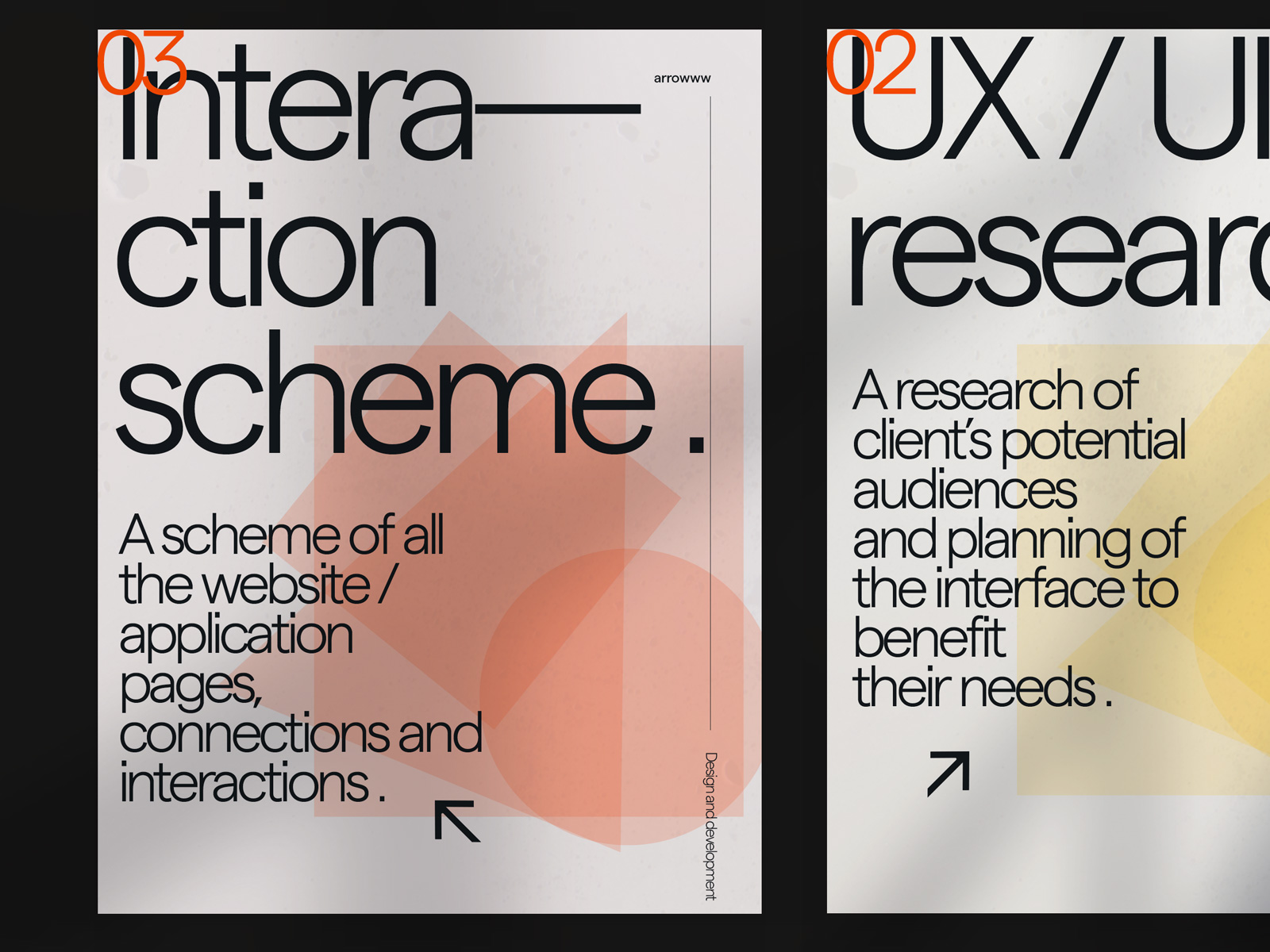
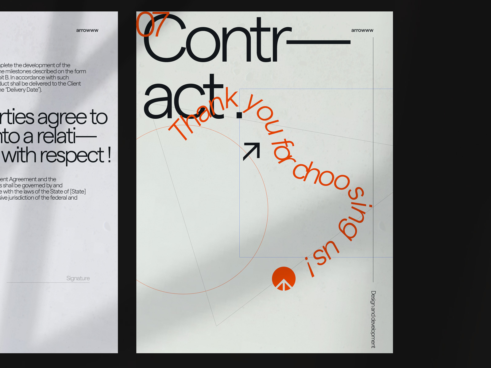
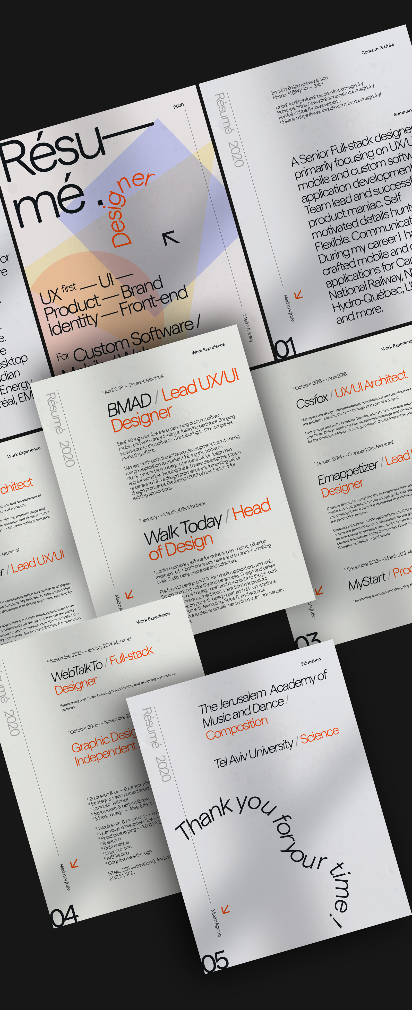
Resume 2020
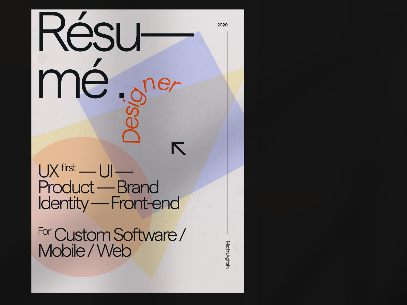
When you can apply the design system you have created to anything and get the effect of similarity and harmony between different materials, then your system (design) is probably good enough. I have designed my 2020 resume following the language developed for the arrowww v16 and in my opinion, it shares the individuality with the rest of the works. I think it is a good test of the system I have developed.
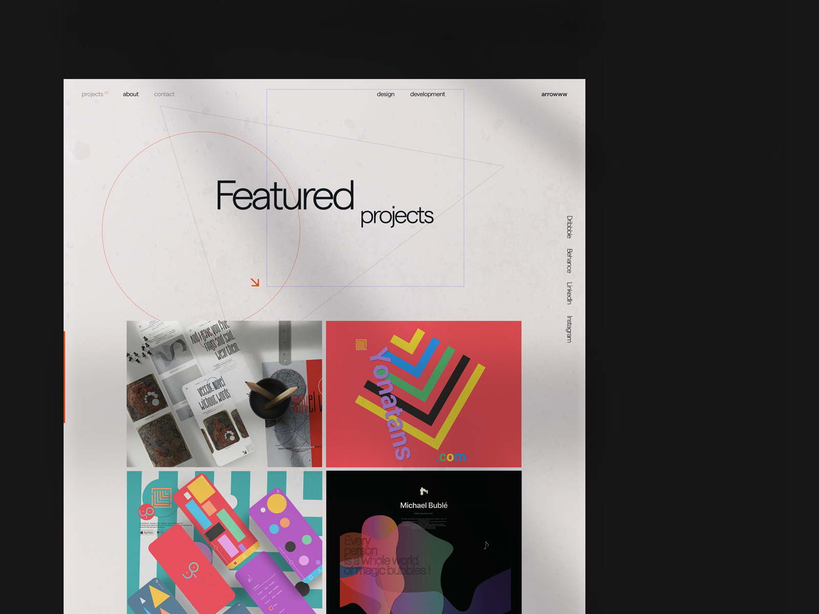
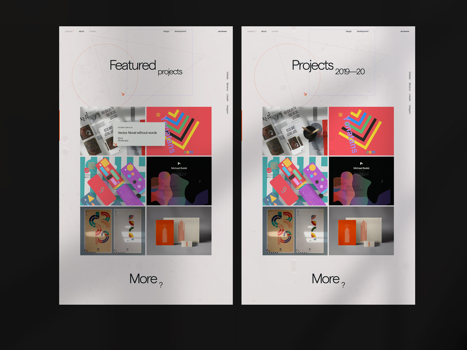
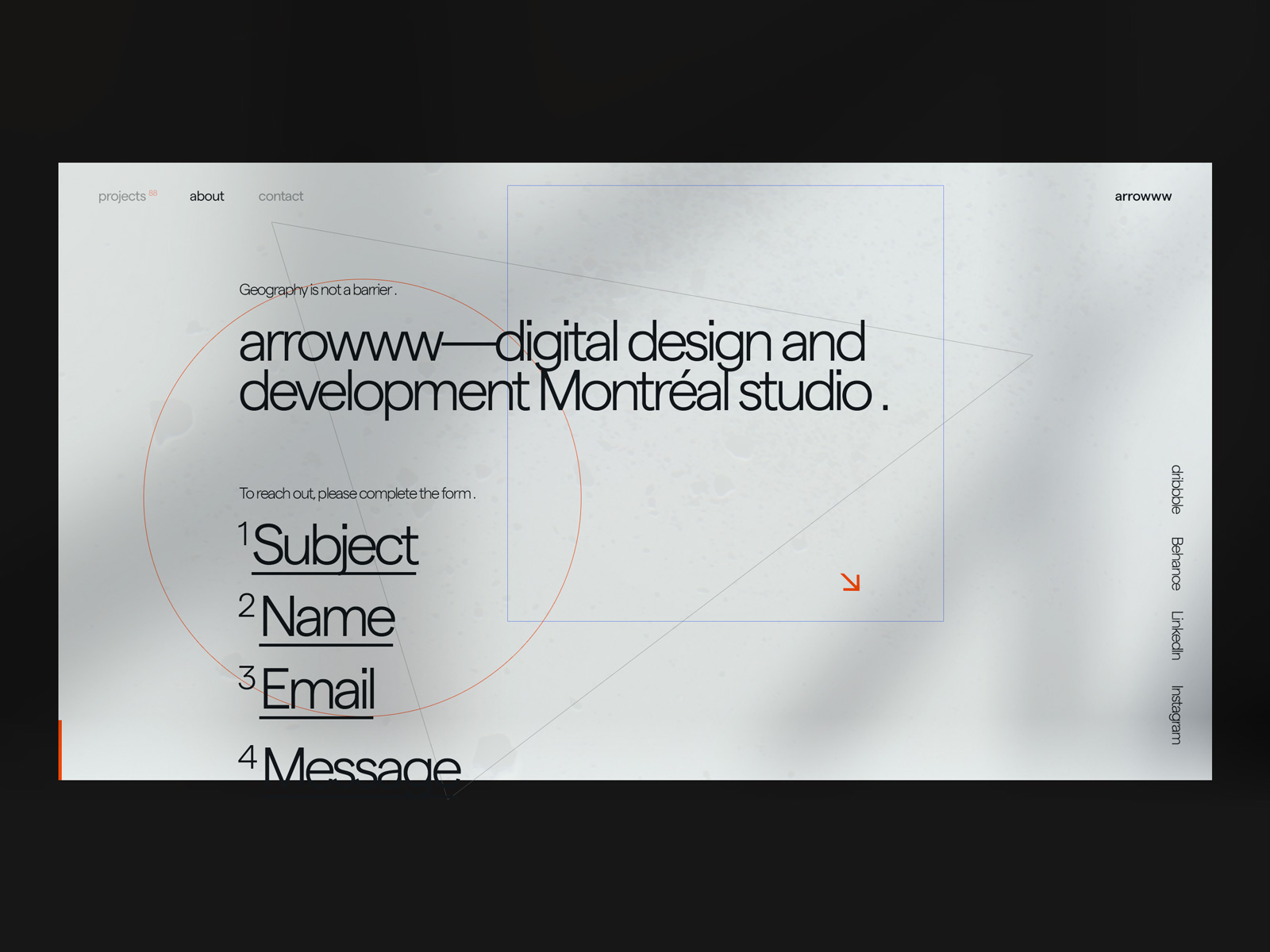
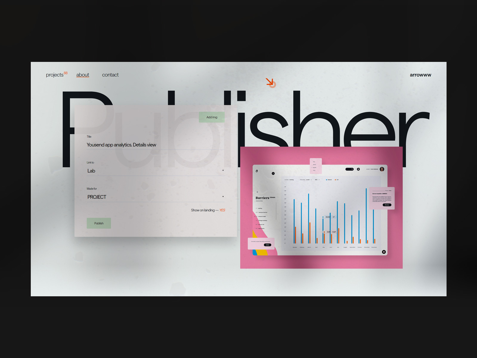
Website
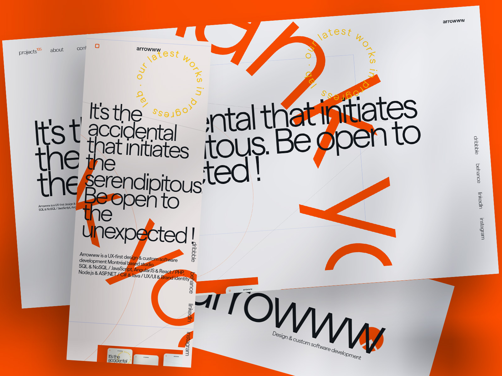
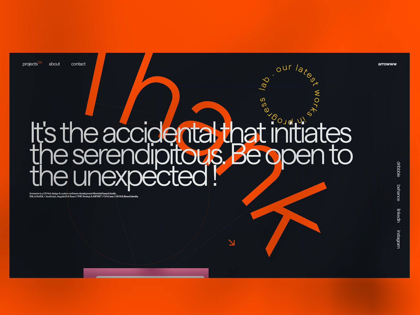
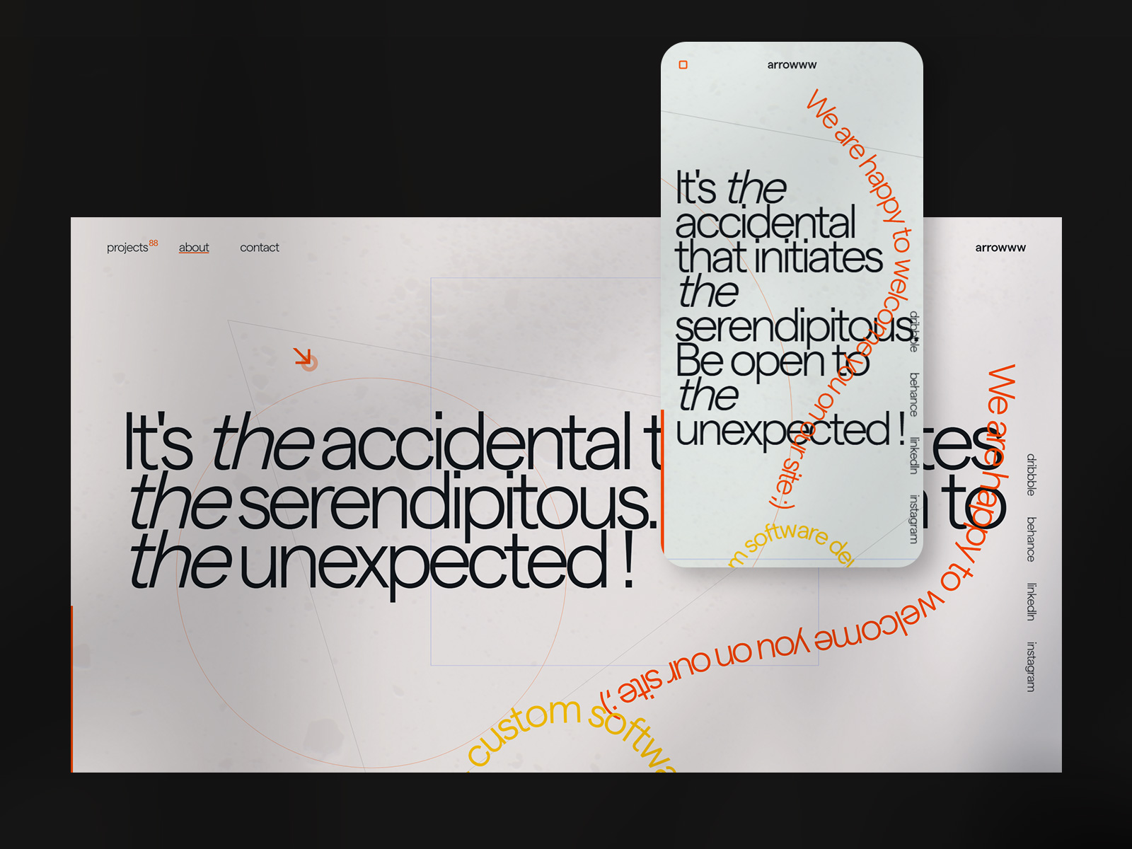
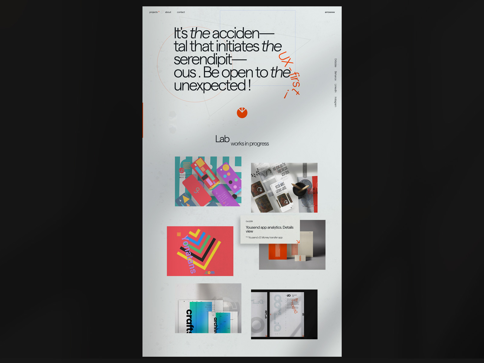
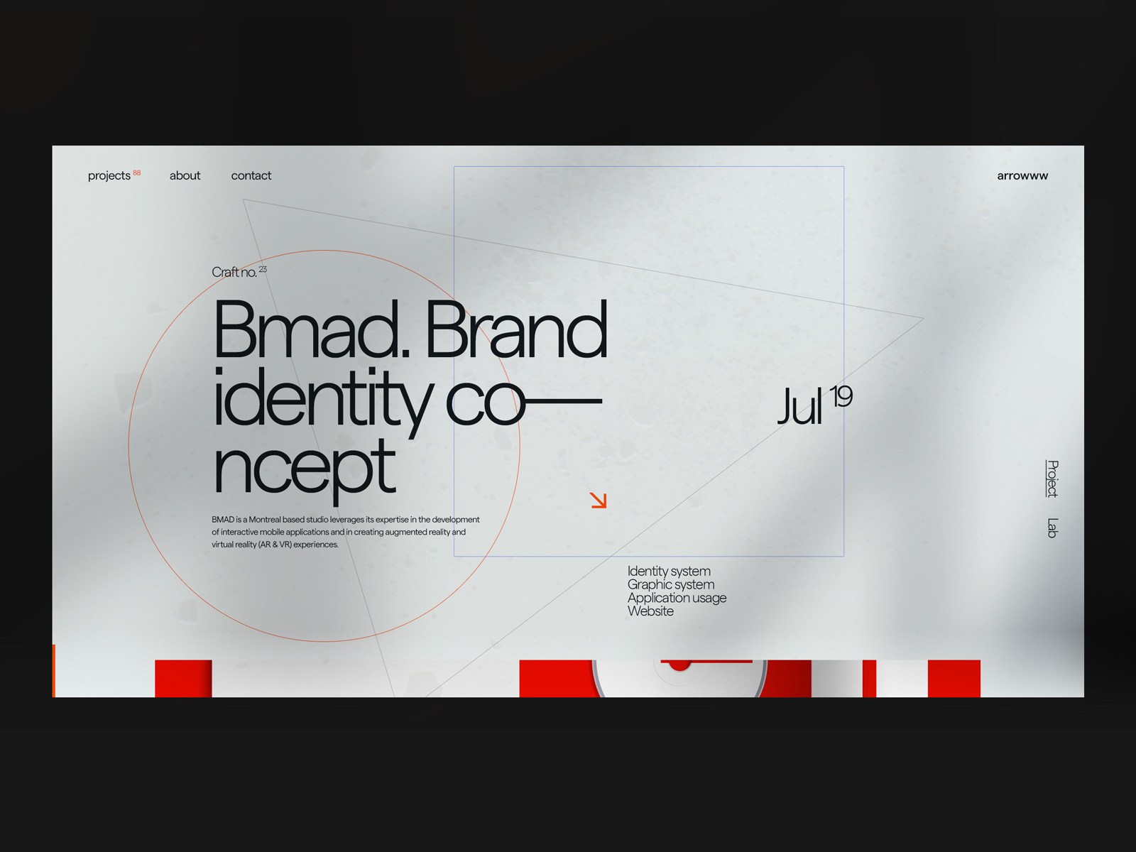
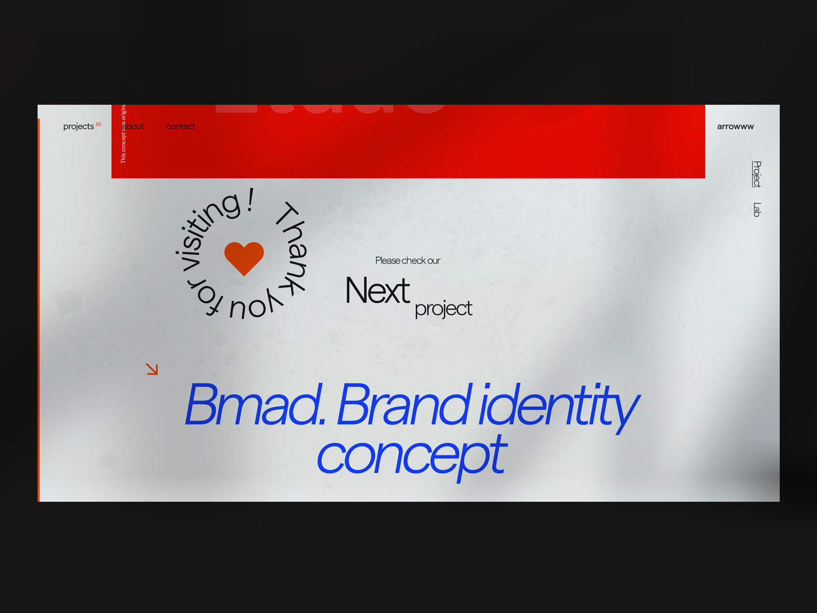
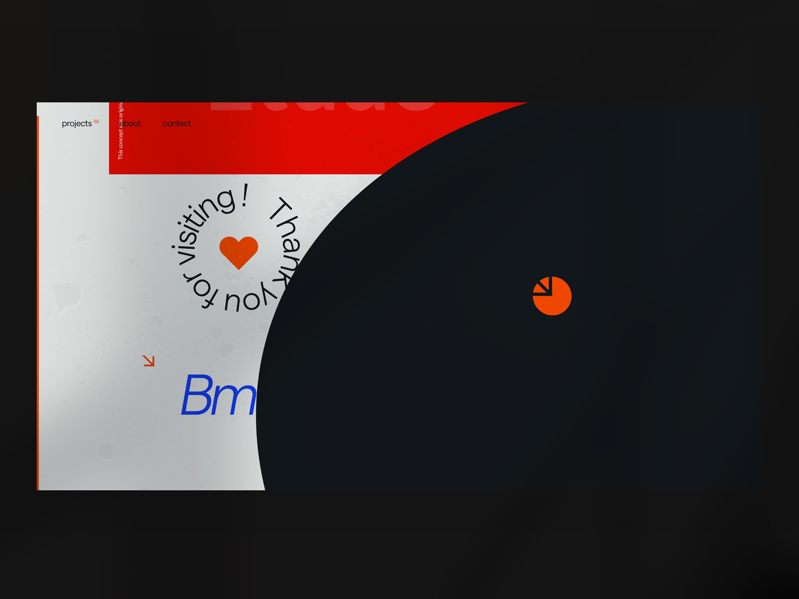
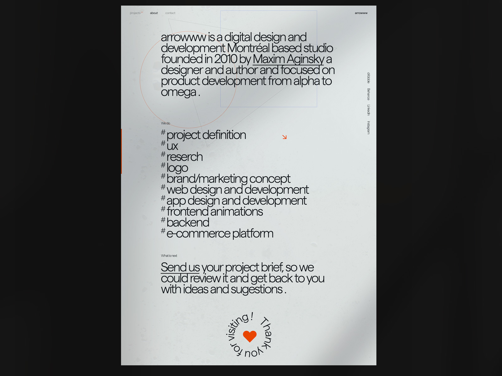
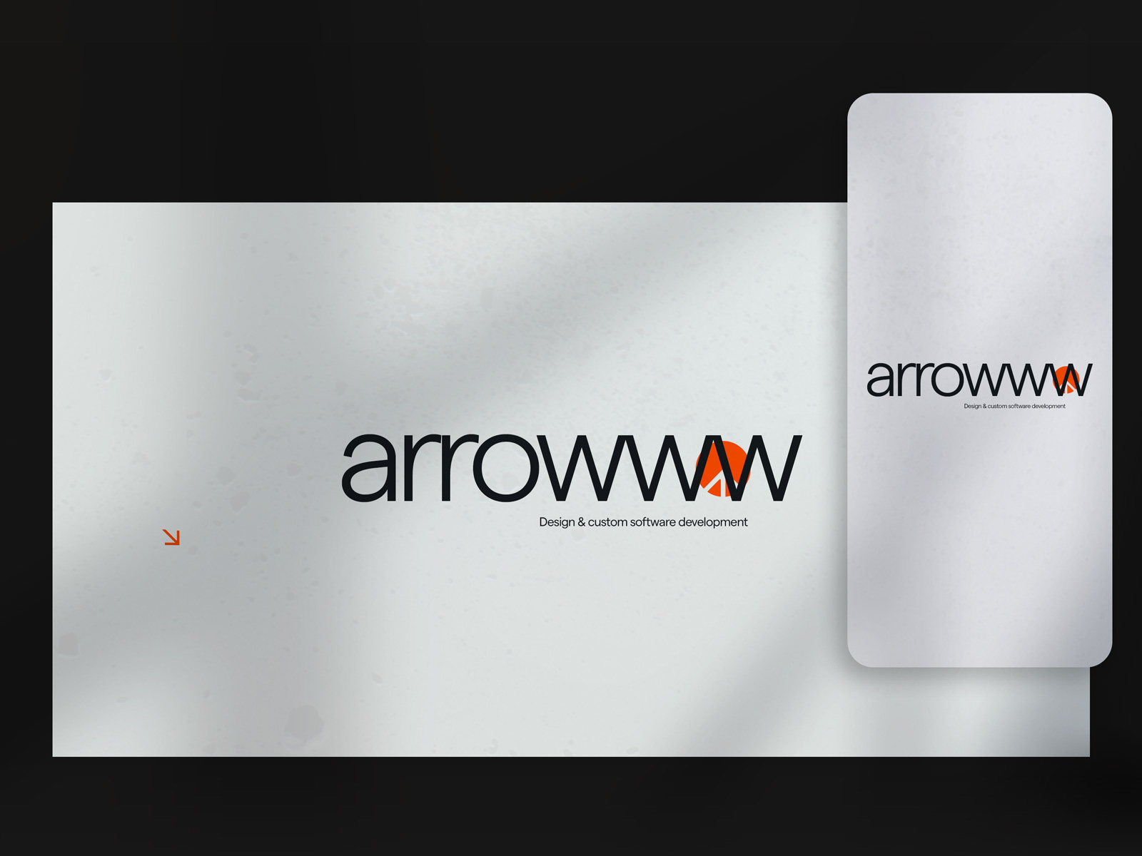
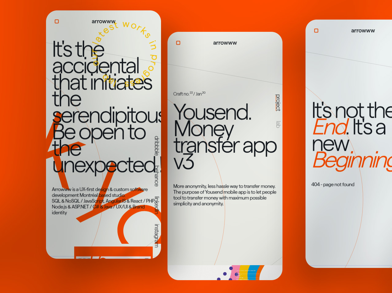
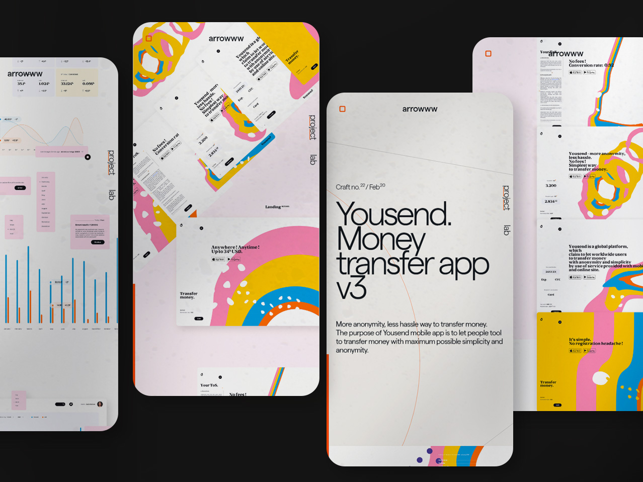
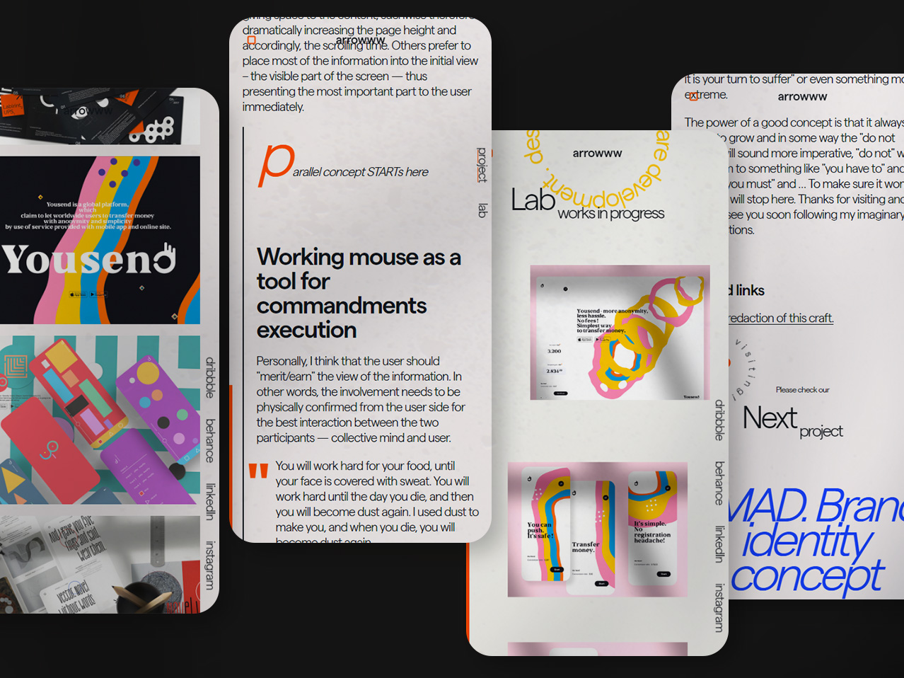
The layout is built the way that allows to construct to scale proportionally. The design will have the same look all over different monitor sizes and devices.
The content will keep the same sizes on screens larger than 1900px and lower than 770px or 420px. In between 1024 and 1900px the content will scale proportionally. I have tried to follow behaviour similar to how the image looks when changing its width – the composition is always the same, just the elements are getting smaller or bigger.
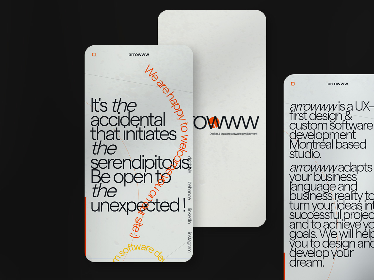
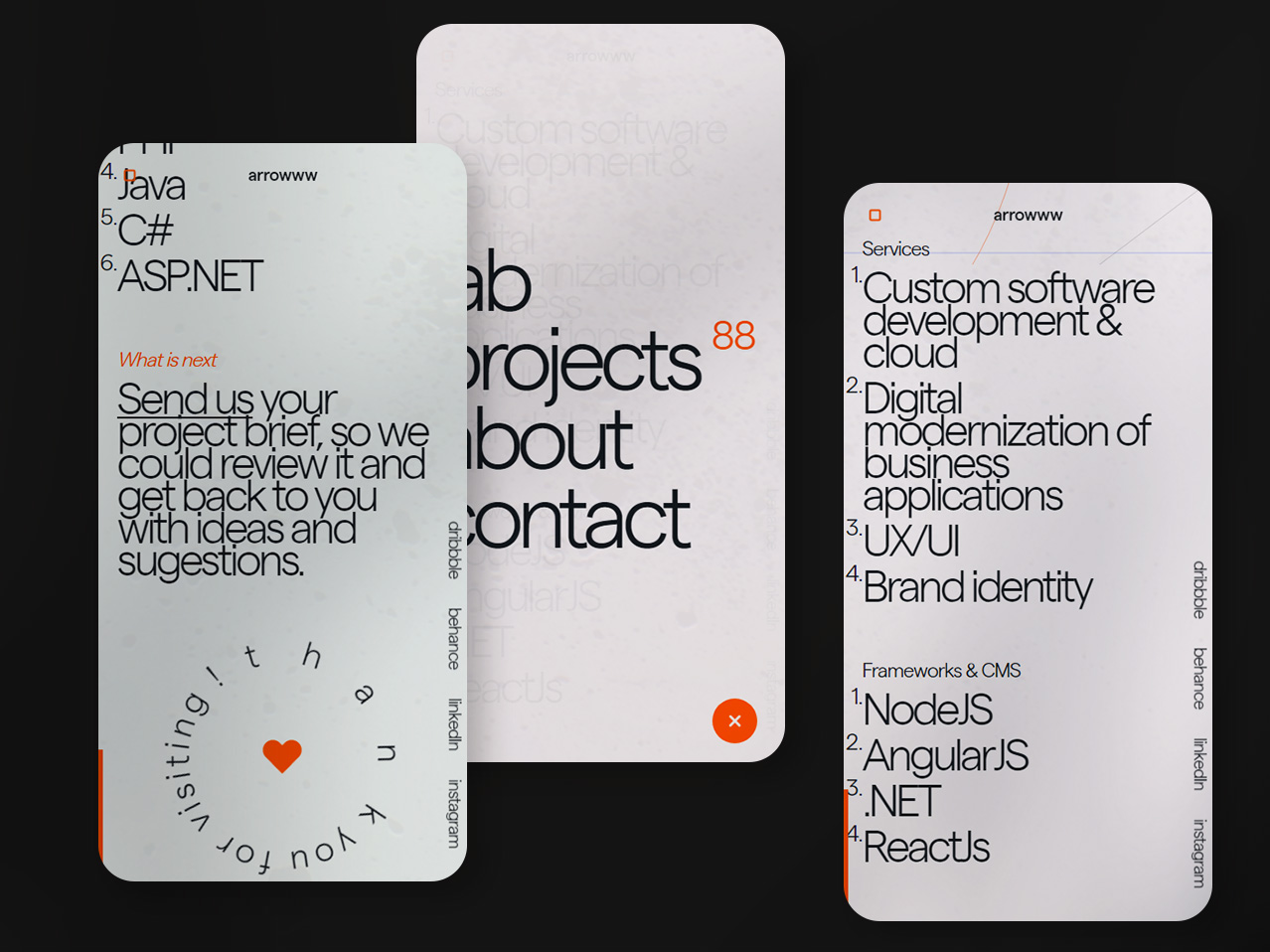
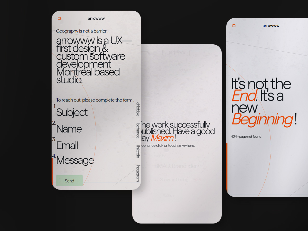
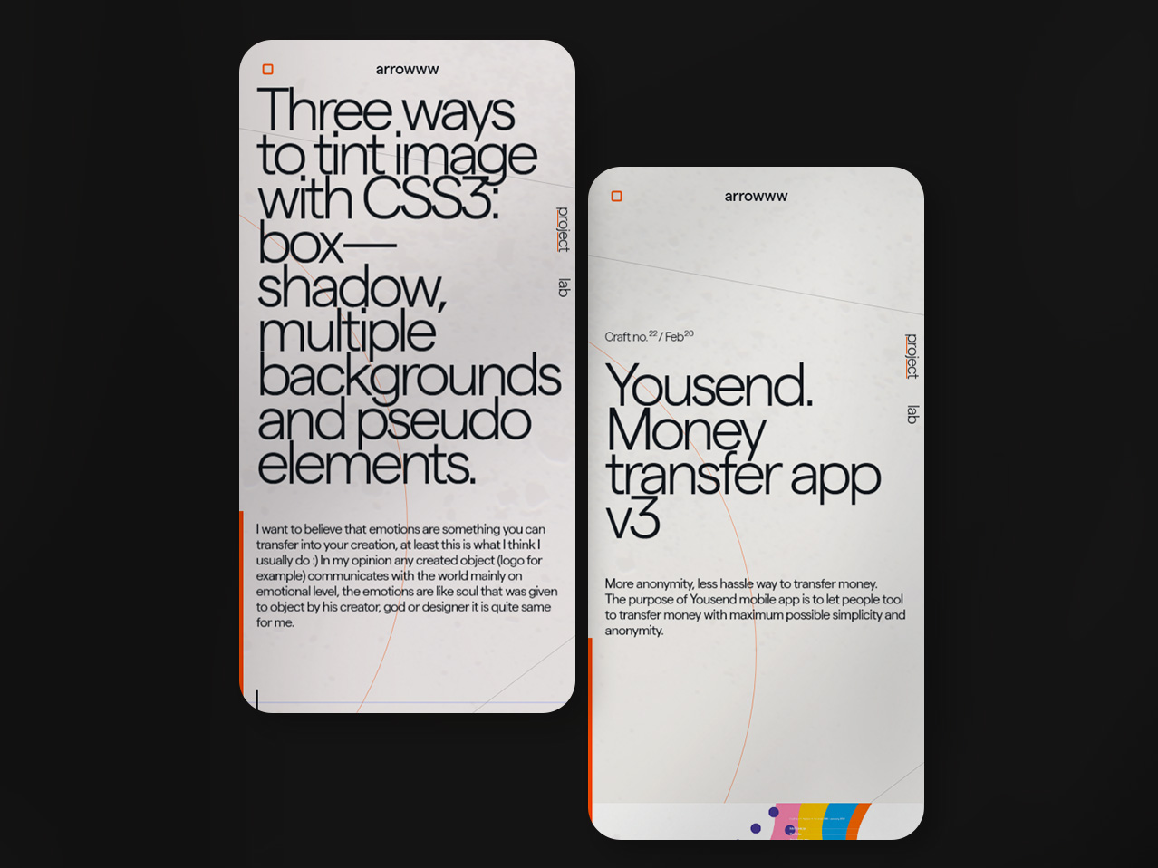
Mobile
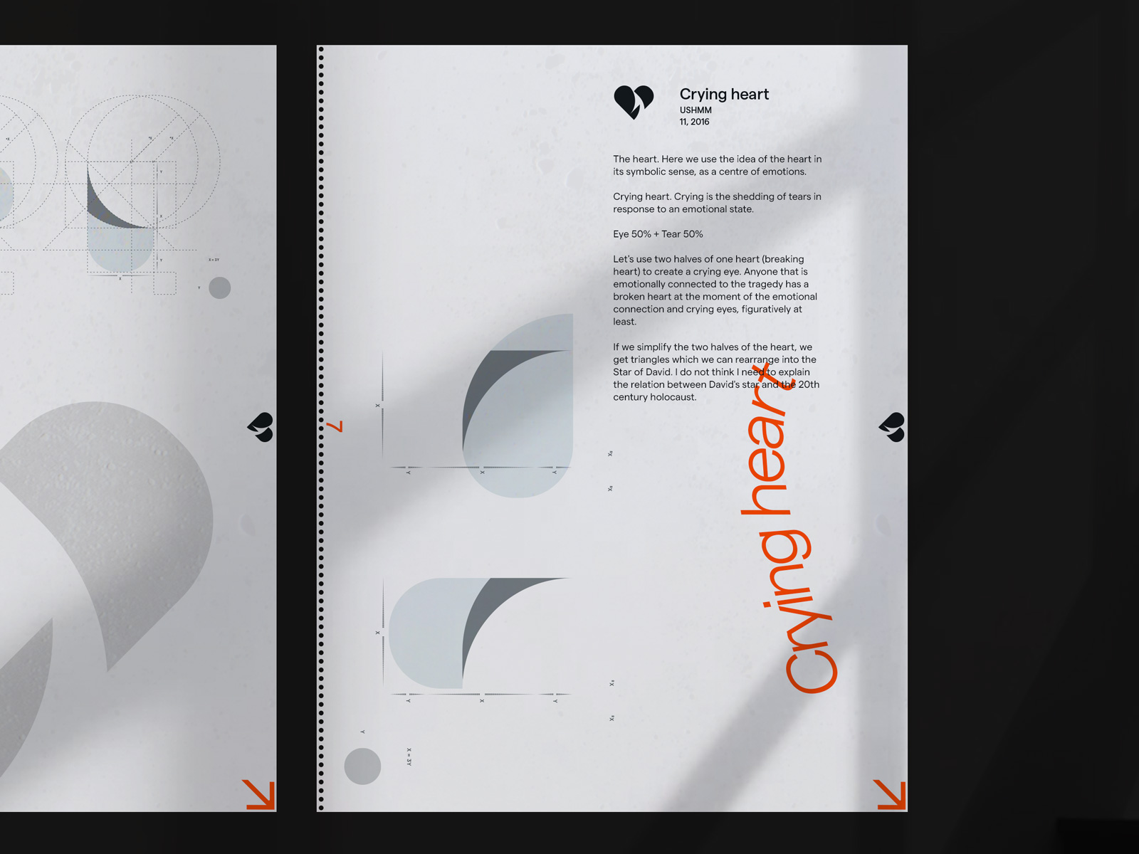
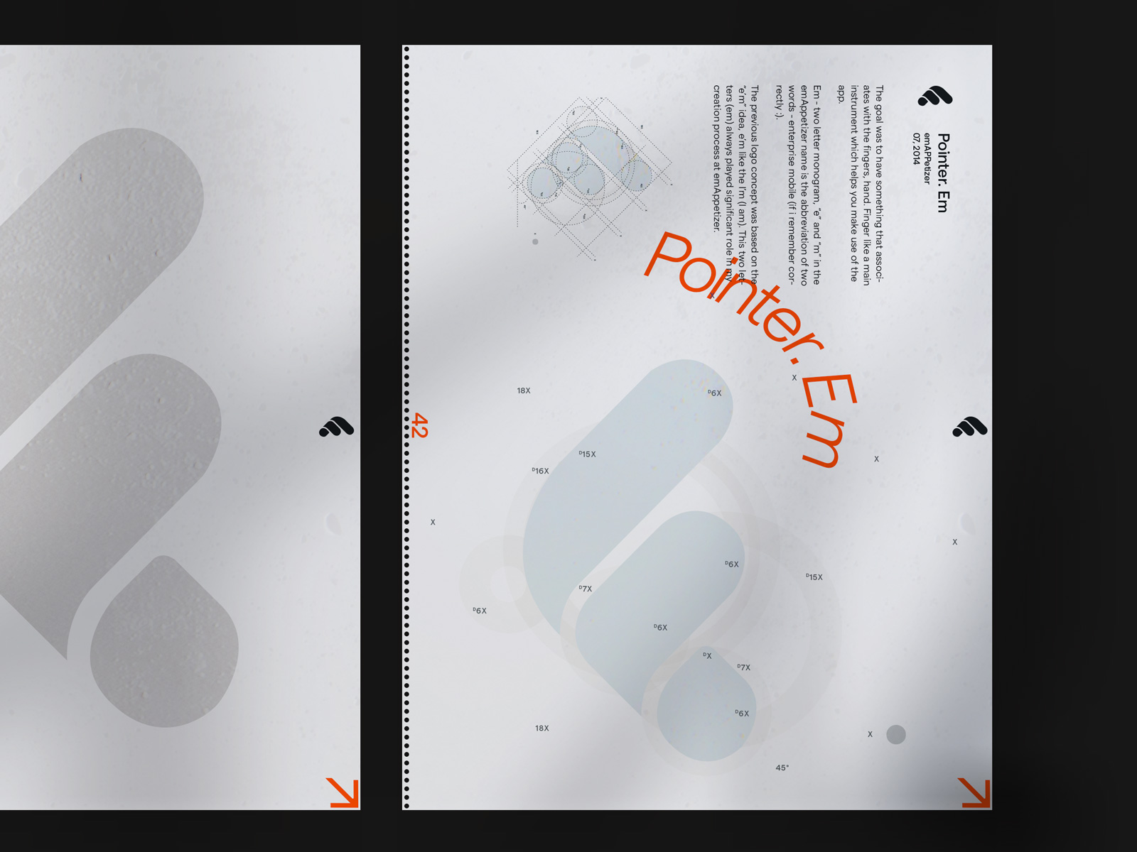
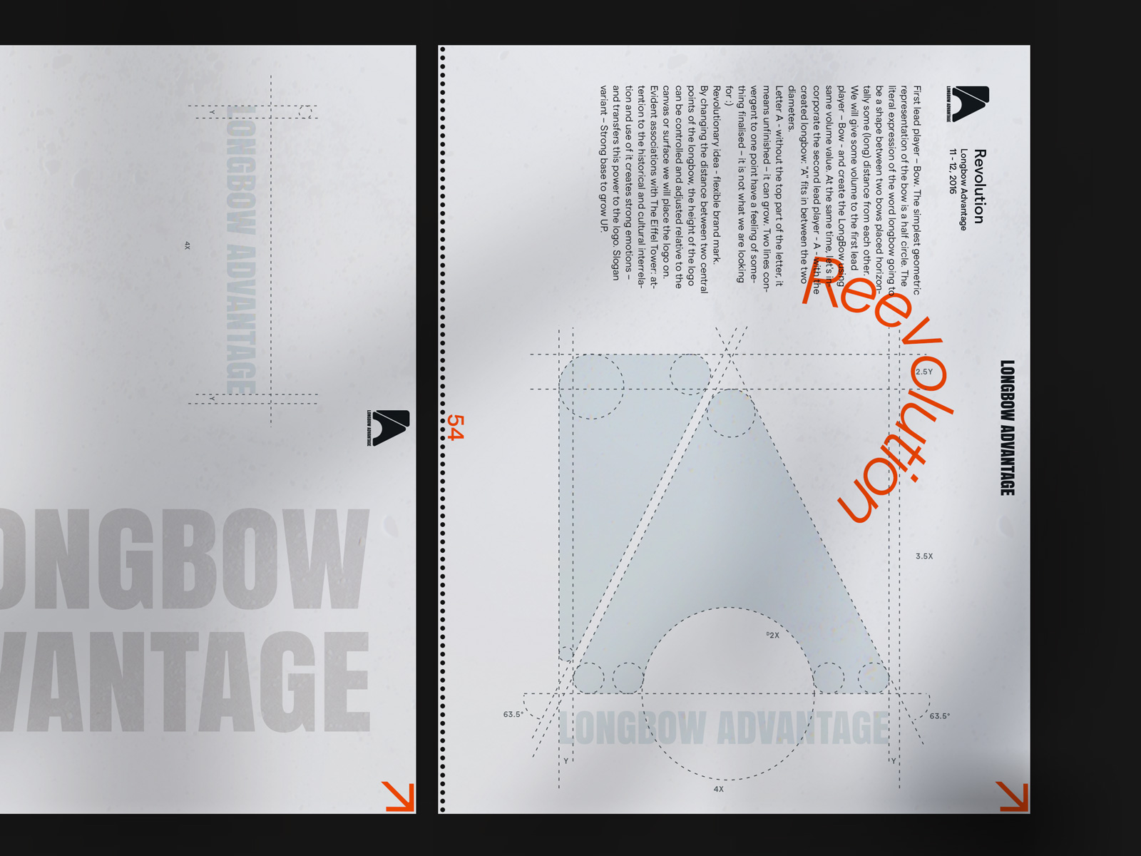
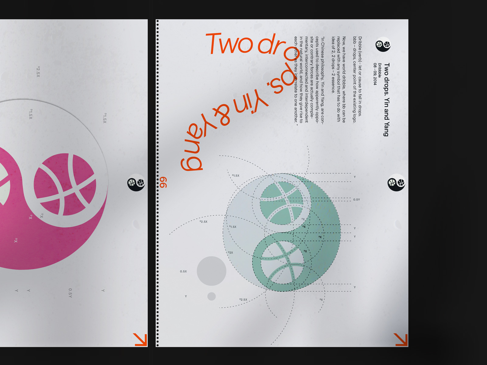
Logo book
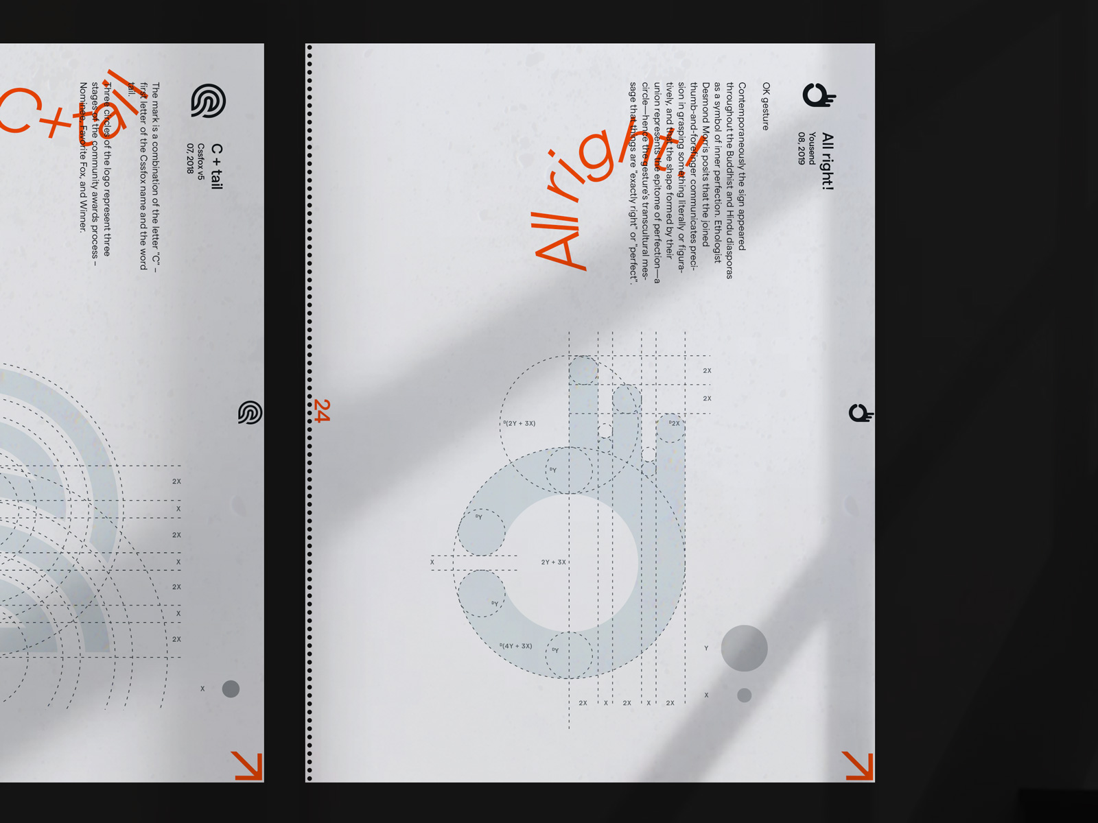
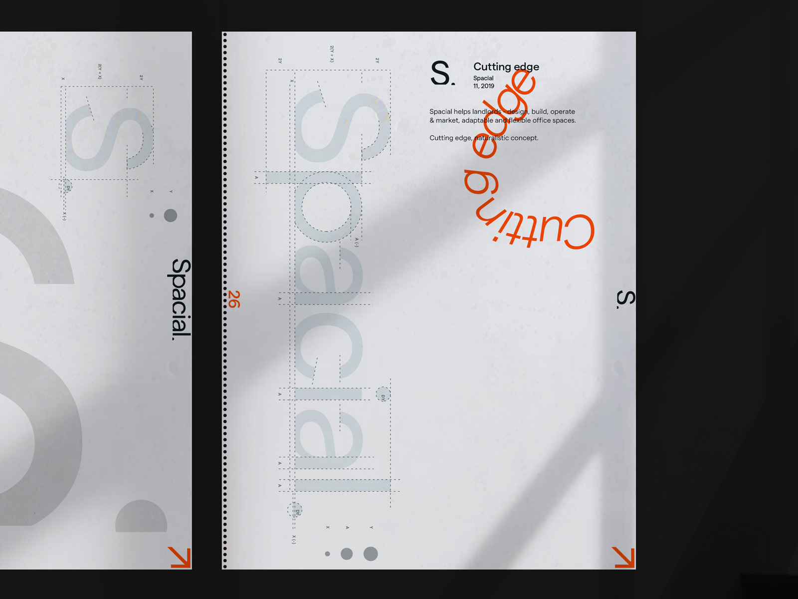
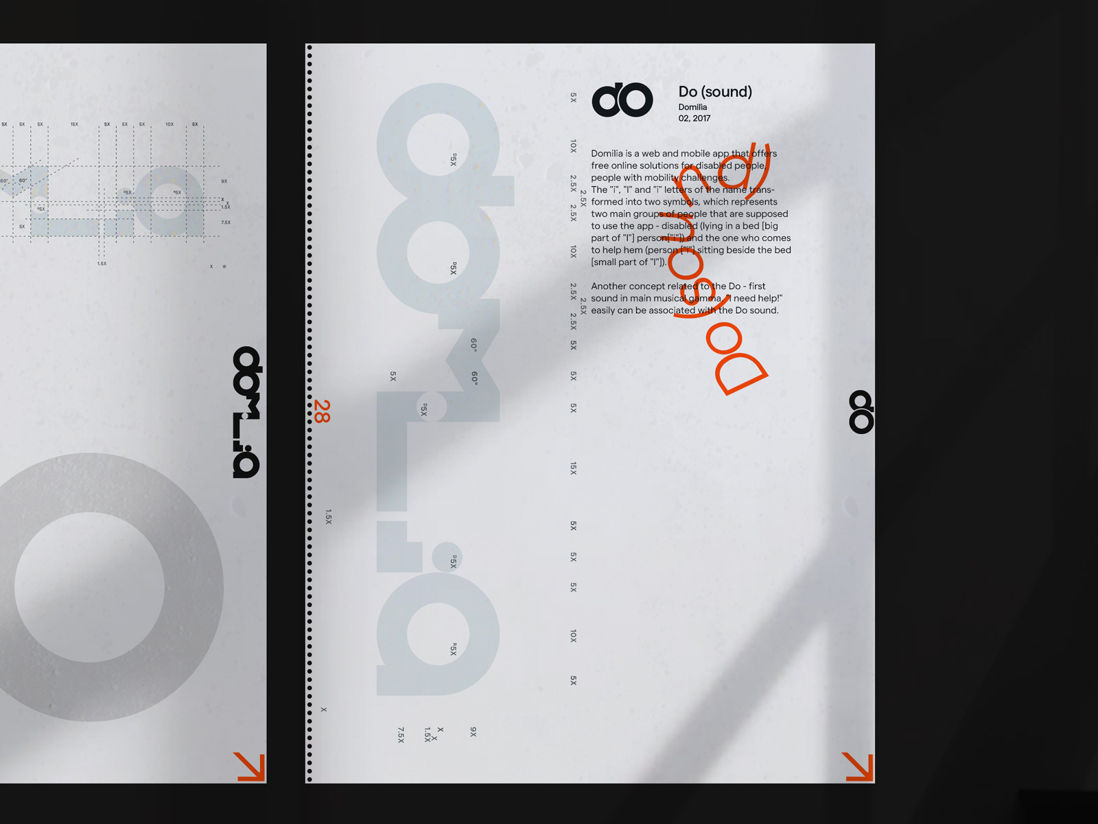
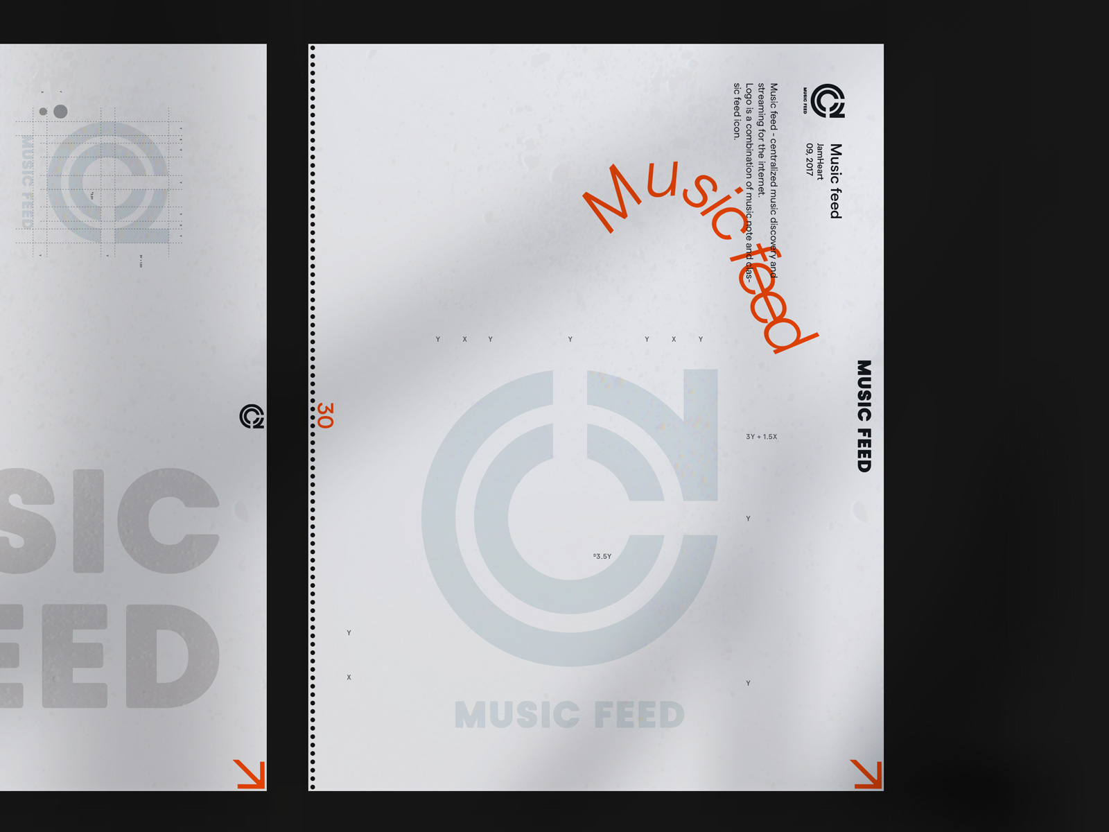
Anyone visiting our office has to be able to enjoy the things we have created. The print version of our logos is one of the elements of this strategy. Cup of coffee along with a good book, what else can you ask for ;)
